DASHBOARD OVERVIEW
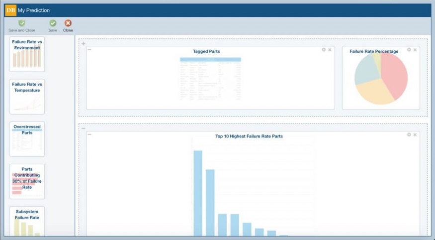
The Relyence Reliability Prediction Dashboard provides an at-a-glance overview of your reliability prediction related metrics. Combining all the data you need for quick assessment, the Dashboard offers the ability to monitor and manage your prediction tasks with efficiency and effectiveness. This focused overview enables you to quickly gauge system health, empowering you to work proactively to maintain your reliability and quality objectives and turn insight into action.
High-Level, Across-Product Overview
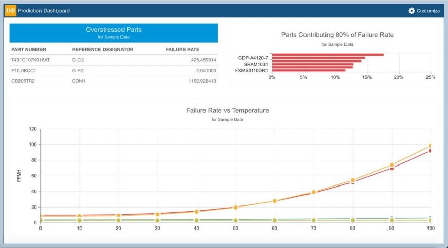
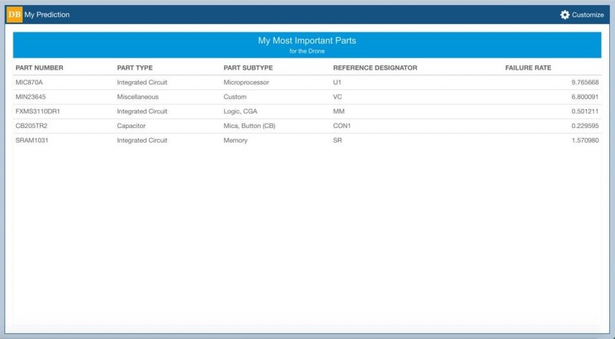
The Relyence Reliability Prediction Dashboard gathers and organizes your prediction data to provide a holistic overview of your product or system. You can use the Relyence Reliability Prediction Dashboard to view the components contributing 80% of your predicted failures, parts that are potentially being overstressed, and slice-and-dice an array of other reliability and quality metrics. The Relyence Reliability Prediction Dashboard is useful for managers, analysts, engineers, designers – any or all team members. As with all well-designed dashboards, the Relyence Reliability Prediction Dashboard allows team leaders as well as contributors to gather information in real-time and react to keep quality and reliability objectives on track.
Drilldown Capabilities
While the Relyence Reliability Prediction Dashboard provides a high-level overview, the underlying data is always available at your fingertips with the click of your mouse. The Relyence Reliability Prediction Dashboard’s drilldown feature takes you from a chart, table, or graph directly to the corresponding analysis information. Want to view your component with the highest failure rate? Simply click on the part in your Dashboard and go directly to that component in your analysis. Want to get the detailed data on that component you have marked for further review? Click for quick drilldown access to the component in question.
Customizable Dashboard
The Relyence Reliability Prediction Dashboard is completely customizable, so you can create a dashboard suitable for your needs, or create any number of dashboards. You can define the look and layout of your dashboards, as well as specify properties of your various charts and graphs. You can combine data from other Relyence modules into a single dashboard for a comprehensive overview of system health.
Exporting to Excel-Based Reports
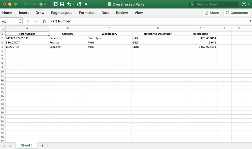
You can easily export tabular Dashboard widgets to Excel spreadsheets. This enables you to include your table-based data in reports, use it in presentations, or integrate with other applications.
Simply hover over the upper left corner of your Dashboard widget until the Excel Report icon appears and click to generate a report. The resulting Excel spreadsheet will be automatically downloaded to your default downloads folder.
The Widgets
Using the easy drag-and-drop interface, select from the comprehensive set of dashboard elements, or widgets, to include in your dashboard. The widgets built into the Relyence Reliability Prediction Dashboard include:
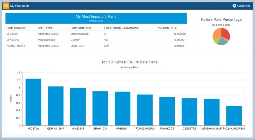
- Failure Rate Percentage: A pie chart showing the failure rate percentage of your subsystems
- Failure Rate vs Temperature: A line chart of failure rate values over a specified range of temperatures
- Overstressed Parts: A listing of overstressed parts
- Parts Contributing 80% of Failure Rate: A bar chart showing the parts whose failure rate contribute to 80% of the overall Analysis failure rate
- Top 10 Highest Failure Rate Parts: A bar chart of the parts with the 10 highest failure rate values

