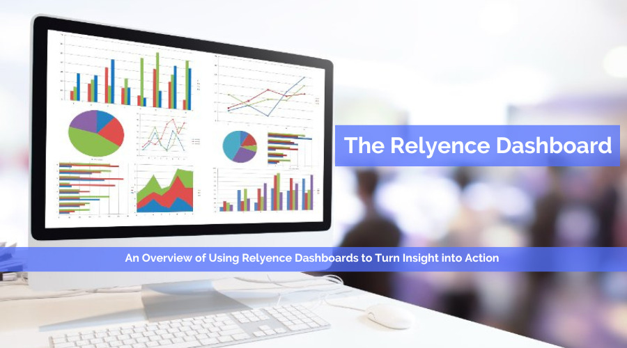
Relyence Dashboards are a highlight of the Relyence tool suite. One of the key advantages of the Dashboards is the ability to aggregate relevant data and present it in a concise, clear visual format. Dashboards can be crafted to allow team members to view information most pertinent for their role. For example, your Quality Analysts responsible for day-to-day implementation of recommended actions want to view different data than your Quality Assurance Managers who need to track schedule status. Dashboards provide a mechanism to effectively meet the needs of all your reliability and quality team members, as well as anyone in your organization who needs insight into critical reliability and quality issues.
What is a Dashboard?
Sometimes referred to as a digital dashboard, a software-based dashboard provides an at-a-glance overview of critical system metrics or the key performance indicators (KPIs) relevant to your organization in a graphical or tabular format. Dashboards are an effective management tool for aggregating, tracking, and viewing important data. Dashboards are especially helpful at enabling you to view the “bigger picture” – highlighting elements of significance succinctly and clearly. The term dashboard originates from the automotive dashboard that enables drivers to monitor all critical vehicle functions at a glance.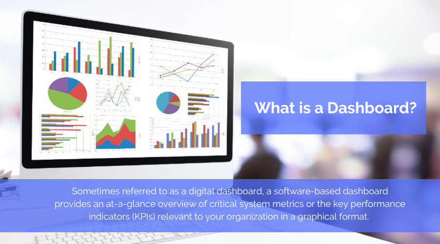
A Reliability Dashboard is a specific type of software-based dashboard that displays reliability performance metrics. Reliability Dashboards can accumulate data from a variety of reliability tools, such as Failure Mode and Effects Analysis (FMEA) and Failure Reporting, Analysis, and Corrective Action Systems (FRACAS), as well as any other reliability tools you employ. By crystallizing the key metrics into an easy-to-digest format, Reliability Dashboards enable you to monitor and track performance metrics with ease.
What are the benefits of a Dashboard?
Have you completed data intensive analyses such as FMEAs or Reliability Predictions and then wondered if there was a better way to review your analysis results without the need to wade through all the captured data? Or have you needed to report your reliability or quality findings to management and wanted a concise and clear way to present the information? Perhaps you want a simple one-page graphical report for a status meeting? Or maybe you want an organized, condensed view to keep tabs on certain items, such as tasks assigned to you, or issues overdue for close out? These are just a few examples where Dashboards can provide the solution!
In addition to offering a solution to issues that commonly arise, there are a multitude of benefits to using Dashboards. Some of the most often cited advantages include:
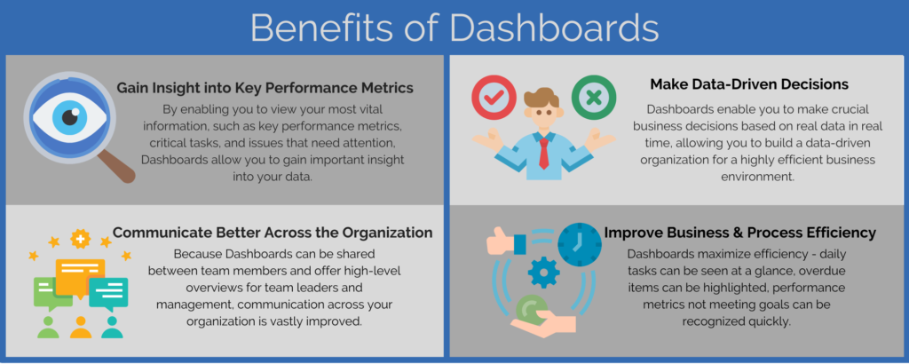
#1: Gain insight into key performance metrics
By enabling you to view your most vital information, such as key performance metrics, critical tasks, safety concerns, compliance findings, issues that need attention, and more, Dashboards allow you to gain important insight into your data. Because the volume of underlying data can be immense and dispersed, Dashboards provide a concise, organized approach to data analysis. Dashboards can also help you track and manage milestones, due dates, and other time sensitive concerns.
#2: Make data-driven decisions
Dashboards enable you to make crucial business decisions based on real data in real time. When you have a wealth of data, it can be difficult to discern the most important elements when needing to make a decision. Without Dashboards, sifting through a large amount of data can be cumbersome and time consuming. Dashboards allow you to see metrics based on the most up-to- date data, and the data is accumulated and consolidated for you.
Due to the easy availability of data, team members can make sound decisions. Knowing that decisions are based on reliable data, Dashboards allow you to feel confident in making important business decisions. An organization built on a data-driven environment creates a highly efficient business operation.
#3: Communicate better across the organization
Because Dashboards can be shared between team members, communication across your organization is vastly improved. Even if one team is working on FMEA and another is working on Fault Tree Analysis, a single Dashboard can combine analysis data into one view. This enables team members to see what others are working on and see the results of other analyses. Also, Dashboards provide a mechanism for team leaders and managers to keep track of important information quickly and easily. Dashboards help to eliminate data silos while also improving cross-team communication.
#4: Improve business and process efficiency
Using Dashboards enables your entire team to work more efficiently. Customized Dashboards can be instrumental for everyone from team members to team leaders.
Daily tasks can be seen at a glance, overdue items can be highlighted, underperforming KPIs can be quickly recognized. Team members can be kept informed about tasks, issues, workflow assignments, and other important information needed to keep them working at peak effectiveness. Oftentimes, analysts begin their day by checking their Dashboard in order to keep track of progress and tasks. Team members appreciate the organized approach to managing daily activities.
Team leaders and managers also greatly benefit from Dashboards. By providing a high-level overview, Dashboards allow leaders to keep performance objectives on track and manage overall process goals. The use of Dashboards affords insight into analysis activities without the need to delve into the details, review multiple analyses, or even ask team members for reports. Everything is available right at your fingertips, customized to what you want to see.
Another bonus of Dashboard views is that they provide a way to see issues when they first arise. This enables you to take early action to control problems before they become more serious and more difficult to correct. A standout benefit of Dashboards is that they enable you to turn insight into action, allowing you to keep your business running smoothly.
What is the Relyence Dashboard?
Relyence Dashboards provide insight into your reliability and quality metrics by accumulating analysis data, filtered and aggregated to your specific needs, and then presenting it in easy-to-read charts and graphs. Relyence Dashboards encapsulate the data across analysis tools in the Relyence tool suite. This includes FMEA, FRACAS, Fault Tree, Reliability Prediction, Maintainability Prediction, and RBD. Because they can be customized to your requirements, Dashboards allow you to monitor data and metrics you deem most critical.
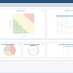
Relyence Dashboards are made up of a set of widgets. A widget represents a single chart or element displayed on the Dashboard. There are several types of widgets, the most common are charts and lists. Example widgets include tabular lists, pie charts, bar charts, line graphs, gauges, funnel charts, stacked bar charts, and several others.
The Relyence Dashboard includes a variety of widgets for viewing data in a clear and concise overview.
Example Relyence Dashboards
There are many uses for the Relyence Dashboard. As you continue to explore the many options available, you will find new ways that the Dashboards will help you keep your reliability objectives on track. Some example uses of the Relyence Dashboard include:
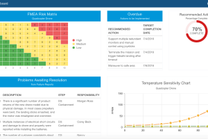
FMEA Risk Matrices
Two of the most popular Relyence Dashboard widgets are the DFMEA (Design FMEA) and PFMEA (Process FMEA) Risk Matrices. They allow you to review the most high-risk items identified in your FMEA. Another important feature of the Risk Matrices is that they are completely customizable, so you can configure these useful charts in a variety of helpful ways.
It is common to see the DFMEA Risk Matrix widget configured with Severity on the x-axis and Occurrence on y-axis. This provides a useful overview of critical items. In each box, you can see the quantity of risk items with that Severity/Occurrence combination. By clicking on the boxes in the Risk Matrix, you can then view the underlying data to get directly to the items needing attention. Coupled with the color-coding of the Risk Matrix, it is easy to zero in on those high-risk items (represented in red below).
Completely customizable FMEA Risk Matrices help you to zone in on high-risk items that require action.
Unique FMEA Risk Matrix Customizations
A unique way to configure your Risk Matrix widget is setting the x-axis to a SOD (Severity, Occurrence, or Detection) value and the y-axis to the Revised SOD value. Items that appear above on the diagonal going from bottom left to top right indicates where Revised values are higher than original values, or those that need attention. The items appearing along the diagonal represent items that have not been changed in any way to lower or increase risk. Items that appear below the diagonal line represent items that have been successfully addressed by the completion of Recommended Actions.
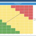
Customizing Dashboard widgets allows you to present data in a useful, actionable format such as this customized FMEA Risk Matrix which clearly highlights critical items that require attention.
An additional unique use of the Risk Matrix widget enables you to view the Severity “count” of your FMEA items. Along with the count, you can see how the items fall in relative Severity based on color-coding. By then clicking on the boxes, you can see the underlying data, allowing you quick visibility into your most critical risk items.

A unique Risk Matrix customized to easily show Severity count.
FMEA RPN Over Threshold
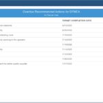
Another useful FMEA Dashboard widget is the RPN Over Threshold widget. It efficiently identifies all Failure Modes with an RPN exceeding your threshold value. From the tabular widget, you can click on any row to drill down and review the Failure Mode in question within your Analysis and assign Recommended Action details or verify the status of pending Recommended Actions.
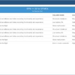
The FMEA RPN Over Threshold widget lists items that are above your RPN goals. Using drilldown allows you to check the status of those items to ensure Recommended Actions are assigned or underway.
FRACAS Incident Pareto
FRACAS Pareto charts, part of FRACAS Dashboards, provide a quick and easy way to track common sources of issues that are occurring. For example, you could group Incidents by location, customer, manufacturing plant, or analysis data such as Failure Mode.
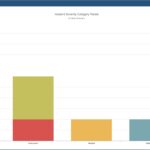
Example of FRACAS Incident Pareto grouping Incident Severity by when they occurred.
Reliability Prediction Failure Rate vs Temperature
A highly popular graph for Reliability Prediction analyses, the Failure Rate vs Temperature graph provides a clear view of your system performance over a range of temperatures. Oftentimes, operating temperatures are part of system requirements, and this graph provides a way to see reliability metrics at both temperature extremes.
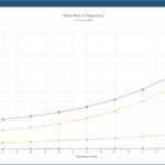
The helpful Failure Rate vs Temperature graph widget enables you to pinpoint those subassemblies or parts most impacted by temperature variations.
Relyence Built-in Example Dashboards
To help familiarize you with Dashboards, Relyence has built-in Example Dashboards you can view. To see these Dashboards, click Welcome to Relyence from the Help menu in the upper right of the Relyence menu bar. On the Relyence Product tab, you will see an “Open Example Dashboard” option. Click that to bring up the Relyence Example Dashboard specific to that Product. Random sample data is used to generate the Example Dashboards. Once viewed, the Relyence Example Dashboards are then available to use as a basis for creating your own Dashboards and will appear in the dropdown selection lists in the Create New dialogs.
How Do I Create a Relyence Dashboard?
Creating a Relyence Dashboard is an intuitive process. The built-in Dashboard Designer brings you to the Dashboard canvas which uses a common drag-and-drop interface. Within the Designer, you can add and remove widgets, move widgets around, change widget sizes, and customize the widgets to your preferences. There are several ways to access the Dashboard Designer to create a Dashboard:
- Click View All in the Sidebar, and from the View All dialog, choose Create>New from the toolbar.
- Select Manage Analyses function in the Account menu and then click Create>New from the toolbar.
- If a Dashboard is active, click Create New…from the top item (the Dashboard Selector) in the Sidebar.
- If no Dashboards are yet available, click Select Dashboard>Create New… from the topmost item in the Sidebar.
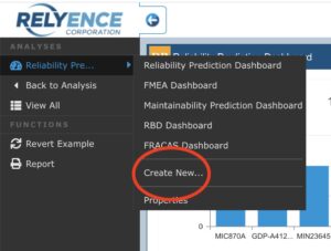
At this point, a Create New dialog appears. In this dialog, if necessary, select Dashboard in the “I want to create a new” dropdown selection list. Enter the name of your new Dashboard and an optional Description. You can choose whether to create a completely new, empty Dashboard or create a new Dashboard based on an existing Dashboard by clearing or selecting the “Create based on an existing Dashboard” checkbox. Oftentimes, it is easier to create a Dashboard based on an existing one and then make modifications as needed.
Once created, Relyence Dashboards are available to view at the click of a mouse. The topmost item in the Sidebar menu is the Dashboard selector. If a Dashboard was previously active, the topmost item will be “Back to Dashboard” and will return you to the last viewed Dashboard. Or select the topmost item in the Sidebar to select from the list of available Dashboards to bring one into view.
Customizing your Relyence Dashboard Widgets
Relyence allows you to create any number of Dashboards. You may prefer multiple smaller Dashboards, or a single large Dashboard encompassing all your data of interest in one view. You can create Product specific Dashboards, such as those shown in the supplied Example Dashboards. Or you can easily create cross-Product Dashboards that include widgets from your Relyence Products. For example, you may wish to include both FMEA and FRACAS Dashboard widgets on the same Dashboard. With Relyence Dashboards, you can build Dashboards in whatever way is most beneficial for you.
Step #1: Lay out your Dashboard
The first step to create or customize a Dashboard is to build your desired layout by dragging and dropping widgets you want on your Dashboard, placing them in the desired location, and sizing them to your preferences. The second step is then to custom tailor the individual widgets to your needs.
To lay out your Dashboard widgets, click the Customize ( ![]() ) icon in the upper right corner with any Dashboard in view. This will engage the Dashboard Designer canvas. Use the drag and drop interface to place widgets on the canvas and move them around. The plus (+) and minus (-) icons in the upper left corner of the rows and widgets allow you to increase and decrease the size of the rows and widgets.
) icon in the upper right corner with any Dashboard in view. This will engage the Dashboard Designer canvas. Use the drag and drop interface to place widgets on the canvas and move them around. The plus (+) and minus (-) icons in the upper left corner of the rows and widgets allow you to increase and decrease the size of the rows and widgets.
The Relyence Dashboard Designer uses an intuitive drag and drop approach to create customized Dashboards.
Step #2: Customize your Dashboard Widgets
When you first add a widget to your Dashboard, the Properties dialog automatically appears to enable you to customize the widget. You can also access the Properties of any widget currently on your Dashboard by clicking the Properties ( ![]() ) icon in the upper right corner of the widget. The Properties dialog encapsulates all the customization properties for the widgets. You can customize:
) icon in the upper right corner of the widget. The Properties dialog encapsulates all the customization properties for the widgets. You can customize:
- Analyses: choose the Analysis or Analyses you want to include when this widget is viewed.
- Use sample data: select this checkbox if you wish to review a sample set of data. This option may be useful when you are first building your Dashboard and you want to quickly review your layout. Using sample data provides a much quicker render since no actual data needs to be retrieved.
- Only include (x) from a selected Subsystem: choose specific Subsystems within an Analysis to gather data from for this widget. This option is only available if a single Analysis is selected in the Analyses list data field. The option to Include children of the selected Subsystem is also available.
- Customize Dashboard Fields: enter the labels you desire for the column headings in tabular list widgets.
- Use My Titles: enter a custom title, if desired, for the widget.
- Selection options: choose the from the settings available, which is dependent on the widget. For example, on RPN widgets, you can choose whether to include Highest or Lowest RPN values and the number of values to include. Also, for RPN widgets the Use Revised Values checkbox allows you to create widgets based on Revised Severity, Occurrence, and Detection values. For criticality matrix widgets, you can set x and y axes, risk level colors, as well as select a 3D graph option.
- Fields to group by: select the fields to group by for Pareto widgets. For Relyence FRACAS Pareto charts, you can select first, second, and third level data grouping.
- And more depending on the individual widget selected.
Special Features of the Relyence Dashboard
There are several handy features that aid in viewing and analyzing the data presented in Relyence Dashboards.
They include:
- Maximize/Minimize options
- Option to download Excel report
- Drilldown option to view the relevant data
- Option to view responsibilities
- Options to track due dates
Maximize Relyence Dashboard Widgets
Your Dashboard may contain many widgets, and you may want to magnify a particular one for better viewing on your own or in a meeting with team members or management. In this case, hover over the upper right corner of the widget and click the Maximize icon that appears. That widget will be maximized to full screen. To exit full view, simply hover again in the upper right corner and click that Minimize icon.
The Maximize icon enables you to view an individual widget in full screen.
Generate Excel Reports from Relyence Dashboard Widgets
Any of your tabular Dashboard widgets can be exported to an Excel spreadsheet. To access the Excel export feature, hover over the upper right corner of the widget just below the Maximize icon and click on the Download to Excel icon that appears.
The Download to Excel feature allows you to generate an Excel report of tabular lists in your Dashboards.
An Excel file will be automatically generated and downloaded to your default download directory. The widget title is used as the Excel filename.
Example Excel report generated from the Relyence Dashboard.
Gain Further Insight using Relyence Dashboard Drilldown
Relyence Dashboards aggregate the data from your Analyses and present a high-level overview of your key metrics and items of importance. In some cases, you may also want to take a more detailed look at the data underlying the charts and graphs on your Dashboards. This is where the drilldown feature of the Dashboard widgets is helpful. The drilldown feature enables you to delve into the details of the data presented in your Dashboard.
To use drilldown, simply click on the specific data you want to review in detail. For example, if you have the Top N RPN widget on your FMEA Dashboard configured to display the top 10 items, click on any of the 10 line items and you will automatically be taken to the specific item in the appropriate FMEA Worksheet. To return, simply click the Back to Dashboard link in the Sidebar menu.
In some cases, you may see a widget with double-drilldown. For example, the DFMEA Test Plan Status widget shows a pie chart of passed and failed test plans in your DVP&R (Design Verification Plan and Report) Worksheet. Clicking on a piece of the pie chart will bring up a list of the test plans contributing to the particular status. From this list, you can then click on a specific line item to be taken to the test plan in your DVP&R Worksheet.
View Your Responsibilities Using the Relyence Dashboard
Another very useful feature of Relyence Dashboards is the ability to designate “My Responsibilities” in various widgets. This enables you to view the items that are assigned to you.
Simply select the items “that I am responsible for” checkbox when customizing your widget. All items that are assigned to you will automatically be displayed. For example, you can view all Problems in Relyence FRACAS that you are responsible for. Plus, the “that I am responsible” selection is intelligent enough to know who is signed in and viewing the Dashboard. So, for example, you can create one Dashboard and select the “I am responsible” setting for your widgets, and then whatever team member signs in and views this Dashboard will see their assignments – not yours!
Dashboards allow you to filter data to display only items that you are responsible for.
Track Due Dates with the Relyence Dashboard
You can use Relyence Dashboards to keep track of critical information such as pending and overdue due dates. This key information can sometimes be buried in a large Analysis with a lot of data, so using Dashboards to filter this vital information can be greatly beneficial to keeping your tasks on track.
For tasks that have due dates attached, there is a Relyence “Overdue” widget available. Your goal, of course, is to keep that overdue list clear, but using the Relyence Dashboard means you will easily see an overdue item at the earliest possible time, without any extra manual tracking required.
Dashboards widgets designed to display overdue tasks can be very beneficial in keeping work assignments on track.
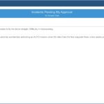
Additionally, Workflow and Approval tasks have various widgets enabling you to track due dates in Relyence FMEA and FRACAS. For example, Relyence FRACAS includes widgets for Incidents Pending Approval, Problems Pending Approval, and Workflow Responsibility.
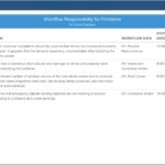
Relyence Dashboard Workflow & Approval widgets enable you to monitor and track tasks and responsibilities.
Conclusion
At Relyence, our mission is to build not only the most capable tools, but also the most technologically advanced and well-crafted applications available. Relyence Dashboards showcase the Relyence advantage: elegant, intuitive design backed up with reliability expertise that makes your job easier.
Relyence offers a free fully functional trial of our complete tool suite! Check out Relyence Dashboard capabilities along with our complete reliability and quality software tool suite.
Feel free to contact us, or call today at 724-832-1900 to speak to us directly about your requirements or schedule a free webinar.